MOGLi
MOGLi is a pioneer in producing healthy organic snacks for children. When founded in 2012 the company’s goal was to offer children and parents an alternative to the conventional and mostly unhealthy snacks for children. We were asked to do the entire website relaunch and help MOGLi sharpen its online strategy.
Client
Damia GmbHMy Role
UX Lead & Project ManagementLaunch
2016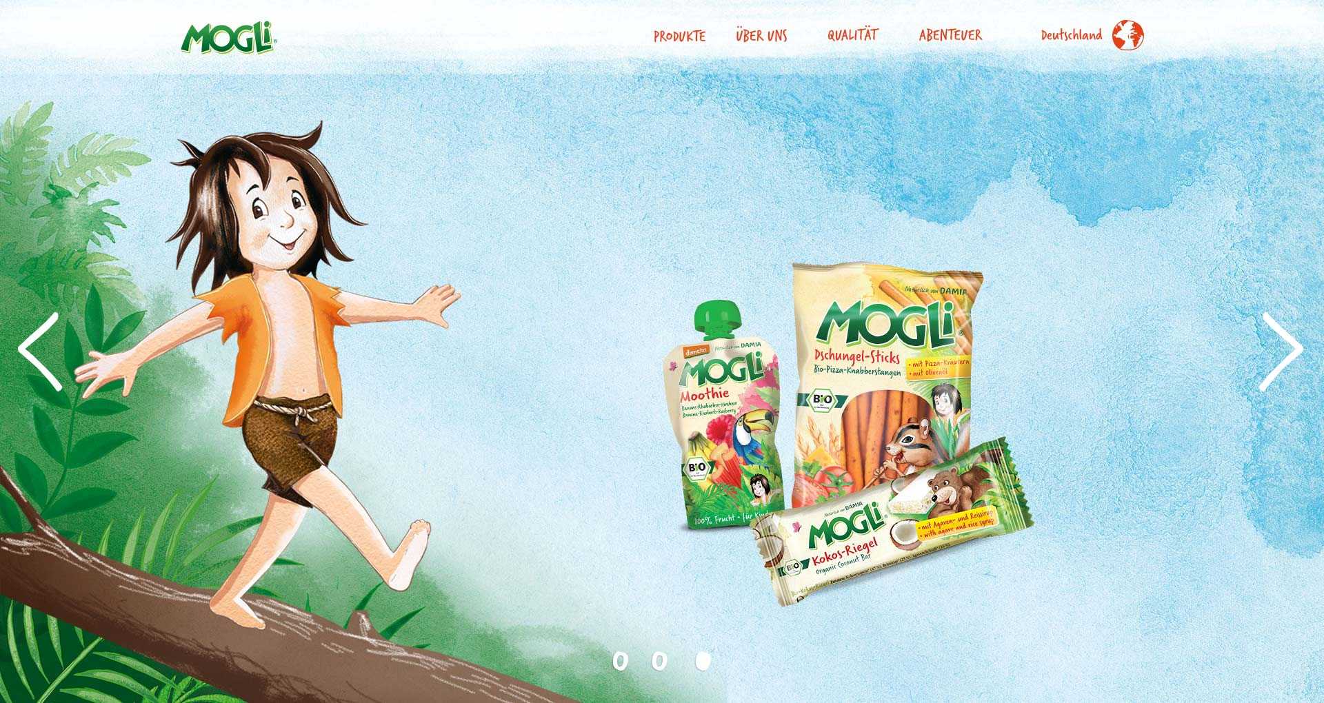
My role
I realised this project together with one developer. The close cooperation with MOGLi’s CEO, the head of marketing and the internal graphic designer was essential for bringing the new website to life.
Understand
I started with a content and structural analysis of MOGLi’s existing website to gain an overview of the current situation.
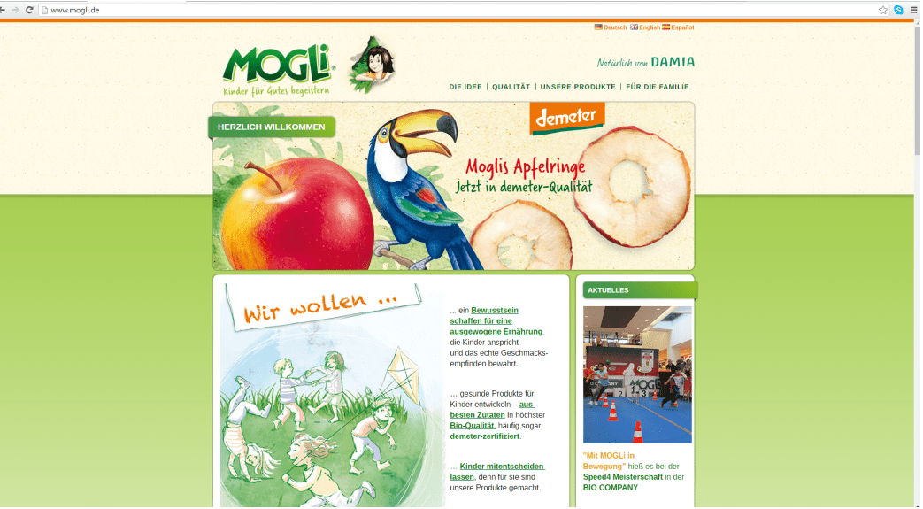
The website was quite “old-school”, had no consistent navigation concept and the content was presented confusingly.
Before moving on with my research, I set up a one day workshop with MOGLi’s whole team. I wanted to get all people involved in the relaunch to know each other and to understand MOGLi’s philosophy, goals and expectations.
After a highly productive day in MOGLi’s Berlin office, I left with a bag full of valuable insights including a clear vision of the brand identity, overall business goals and preferences regarding visual design.
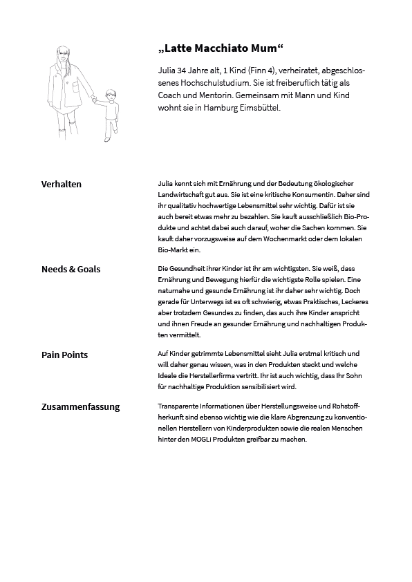
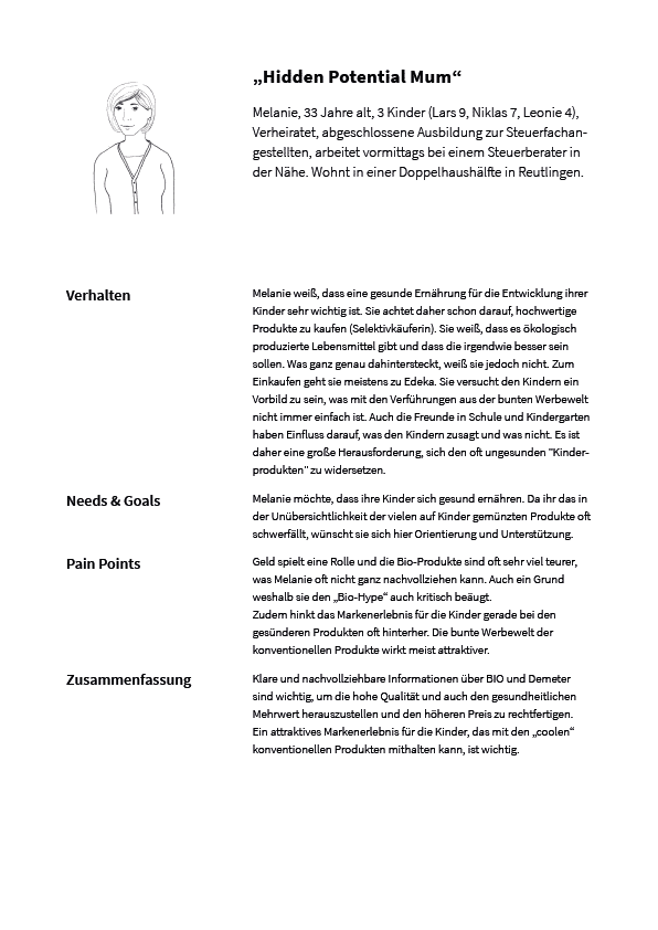
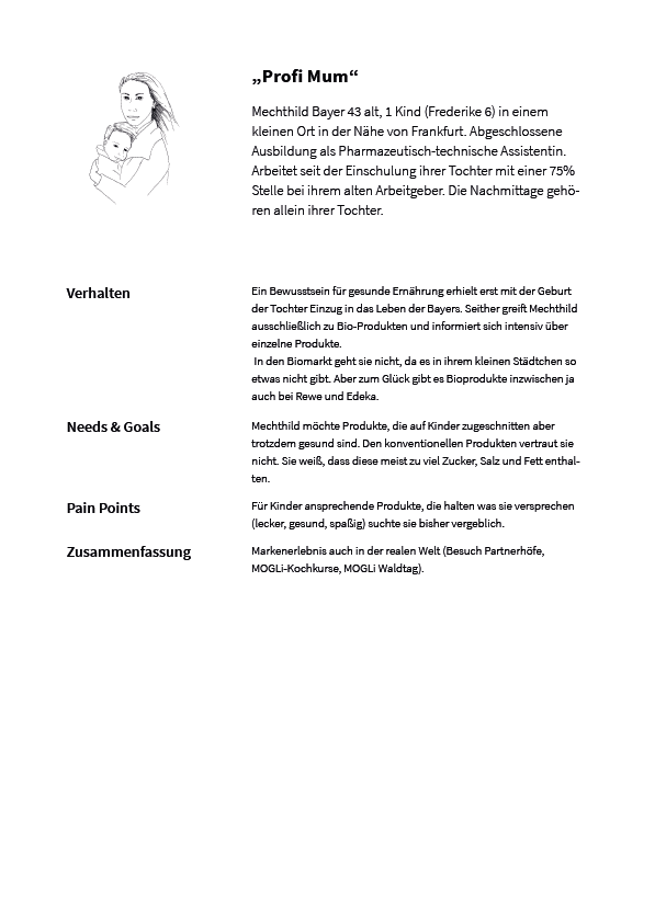
As there were very little data about clients I went through comments on MOGLi’s Facebook page to gain some insights. Together with MOGLi’s head of marketing, we developed three personas to specify MOGLi’s clients' needs, goals and expectations. This helped to decide where to focus on and how to structure the content.
To carve out MOGLi’s USPs I did a competition analysis and a benchmarking in the organic food industry.
My research let me identify four main user goals and four main business goals that should be brought together on the new website.

Concept
Summing up the findings from my research:
→ The first impression should communicate high-quality products
→ The user should be able to find all information about the products (ingredients, nutritional values etc.), about production and the company’s background easily.
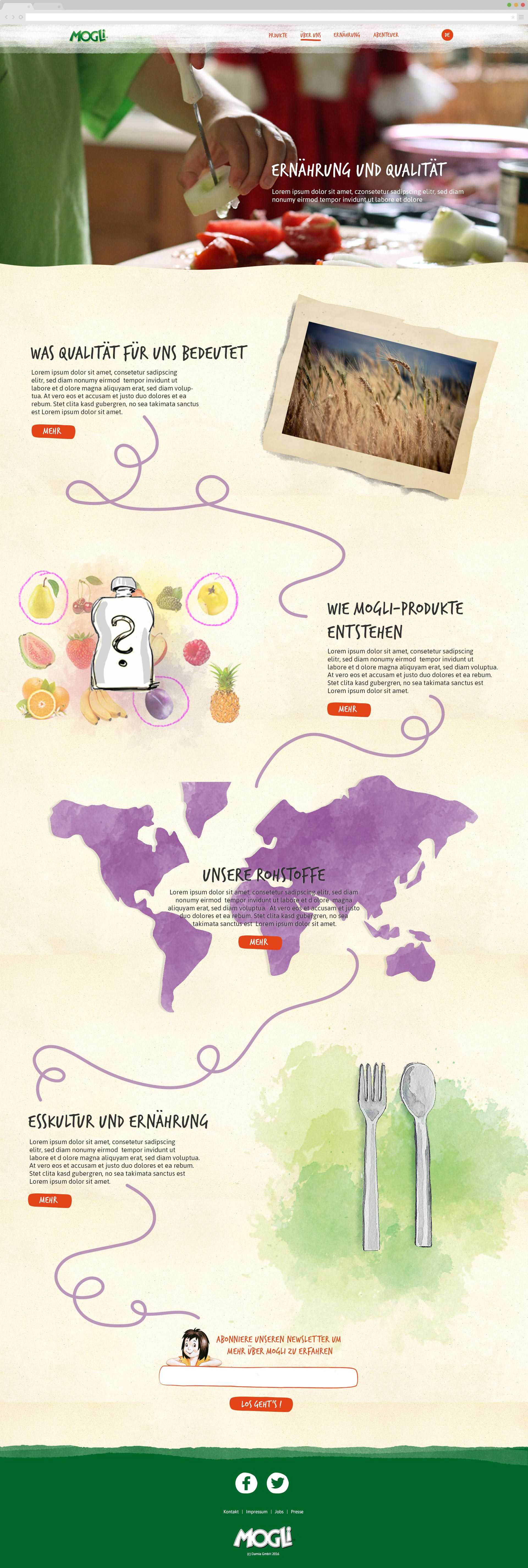
→ The brand’s identity (“Mogli’s adventurous jungle world”) should be implemented without making the website appear too infantile.
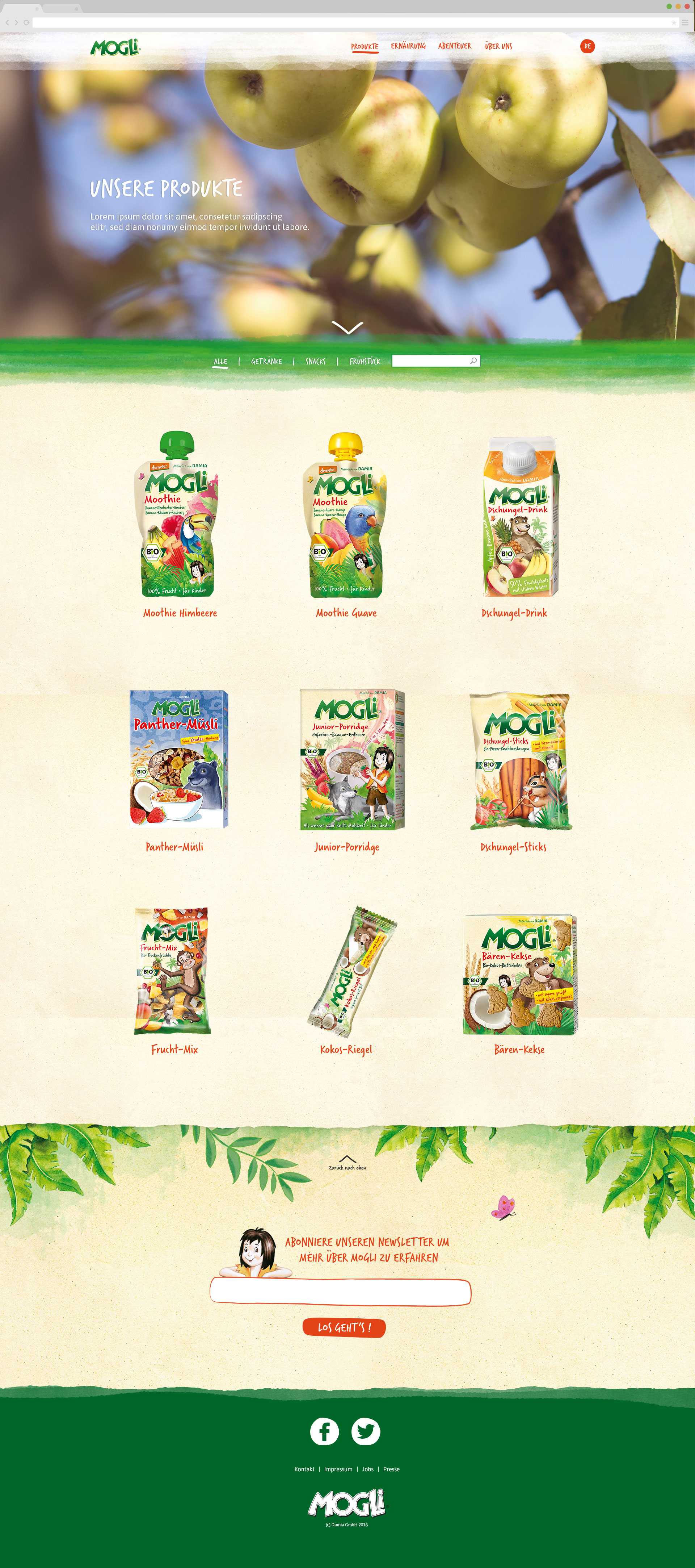
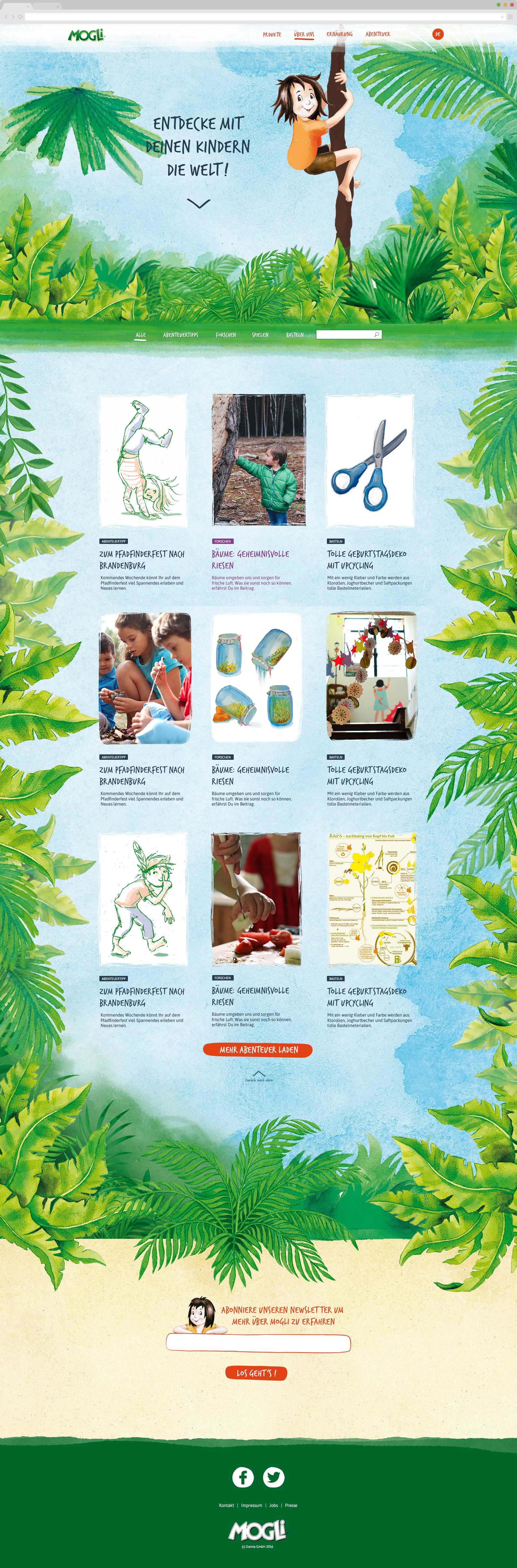
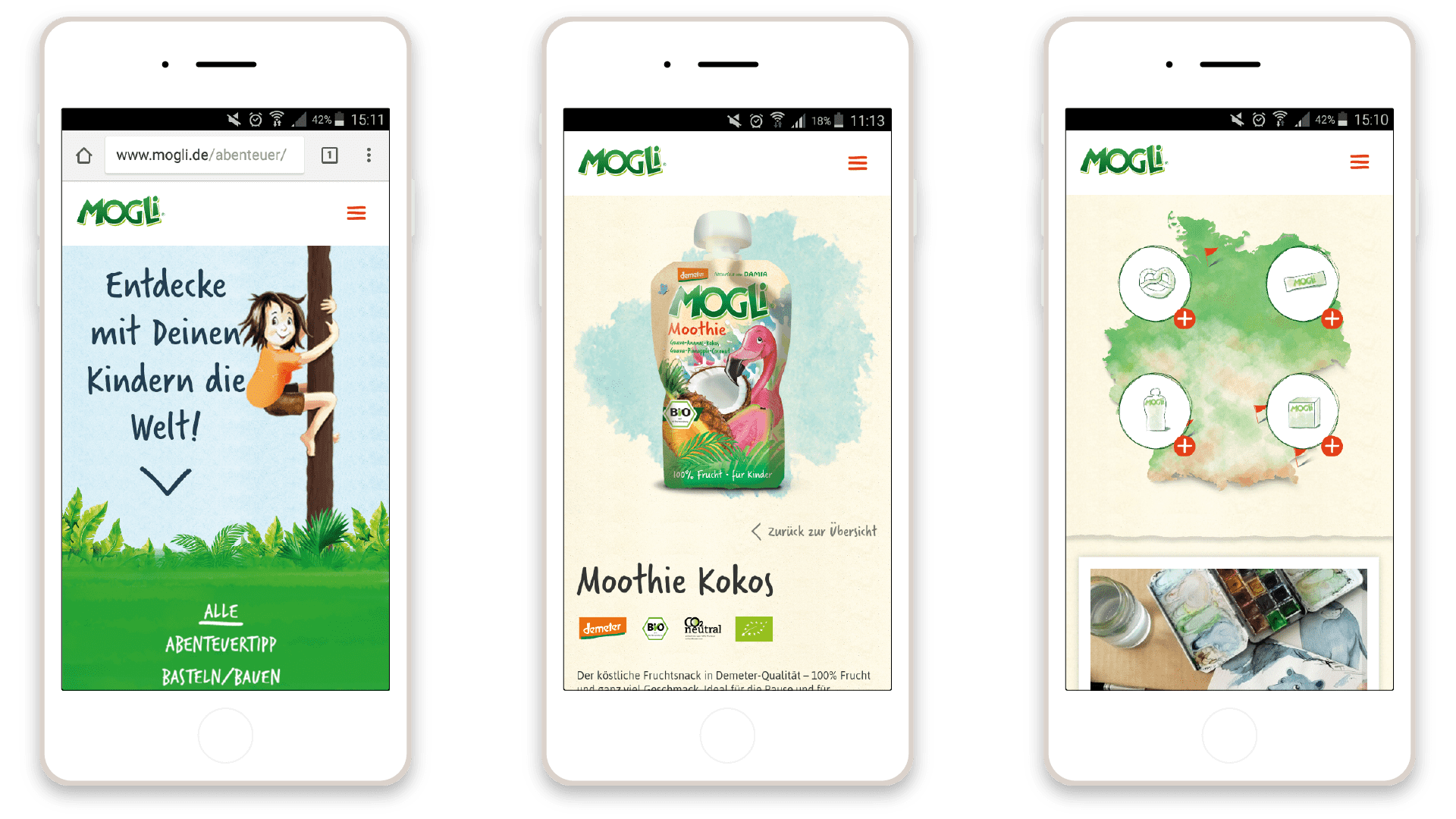
One main part of my concept was “Mogli’s Adventure Page”. This page would serve MOGLi’s content strategy (get children outside and explore nature) and would offer a great brand experience to the whole family while the rest of the website would use a little bit less of the colourful jungle images. Like this, the website would offer both: a reliably appearing source of transparent information and a funny adventurous place for experiencing the brand. With these ideas in mind and the collection of best (and worst) practices from the industry, I finalised the architecture and the navigation concept and developed HiFi wireframes.
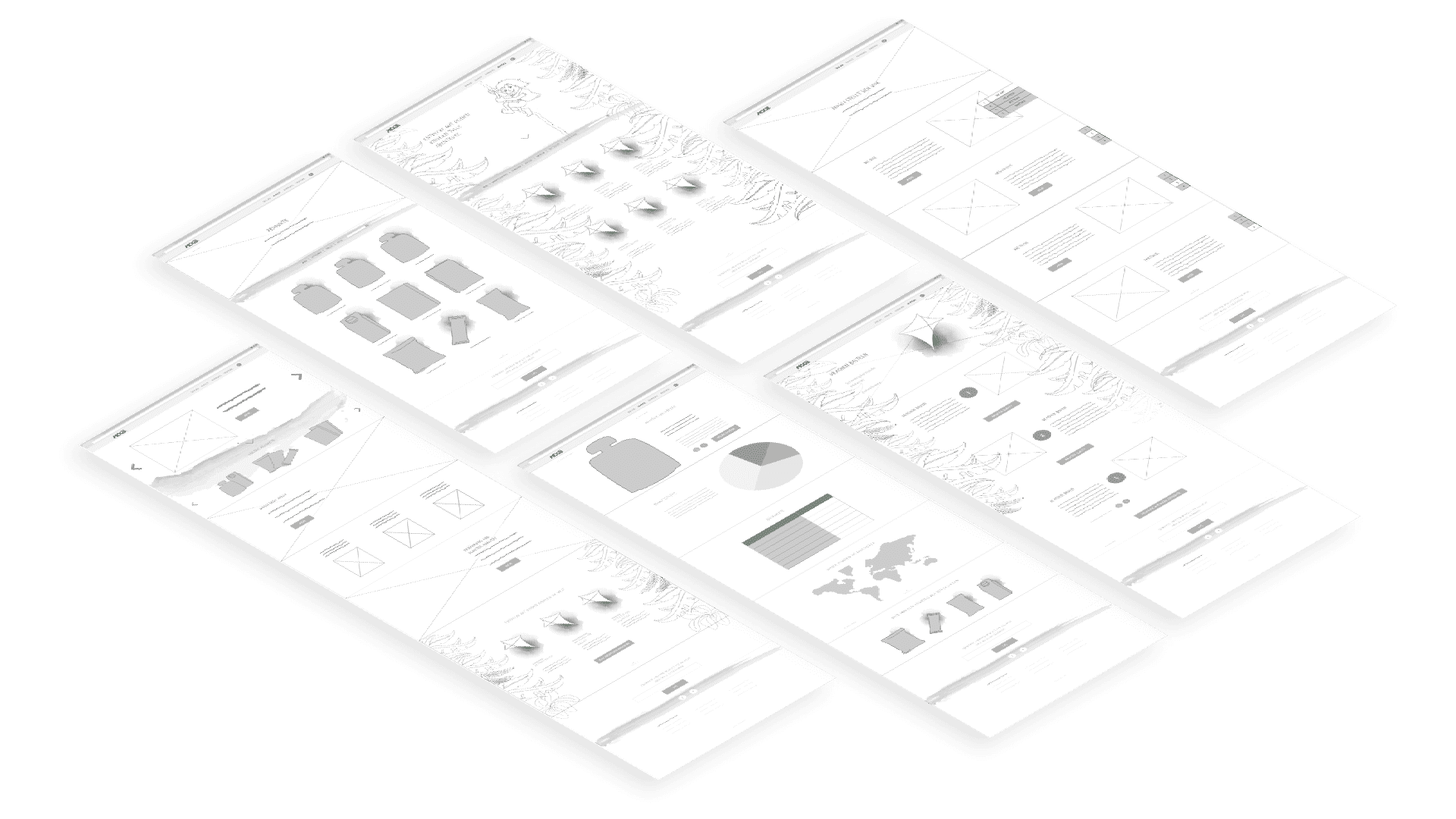
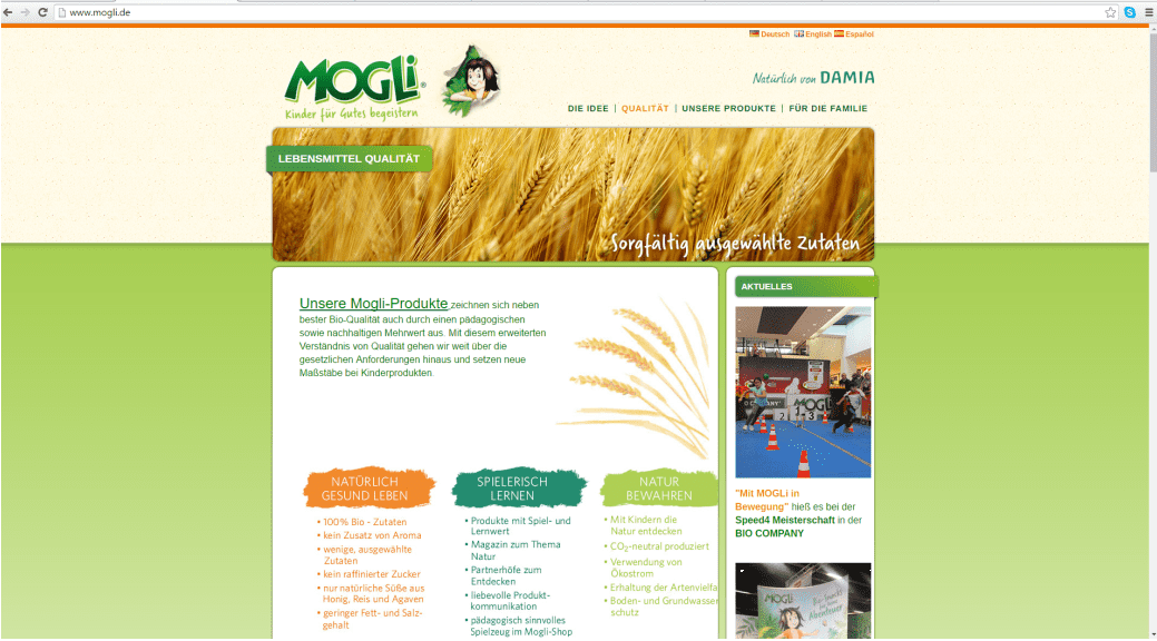
Visual Design
The basis of the visual design was the brand’s existing imagery: handpainted watercolour images of animals, plants and of course Mogli. I combined these with high-quality photos. The design of UI elements was inspired by the visual language of Anthroposophy and Waldorf education.
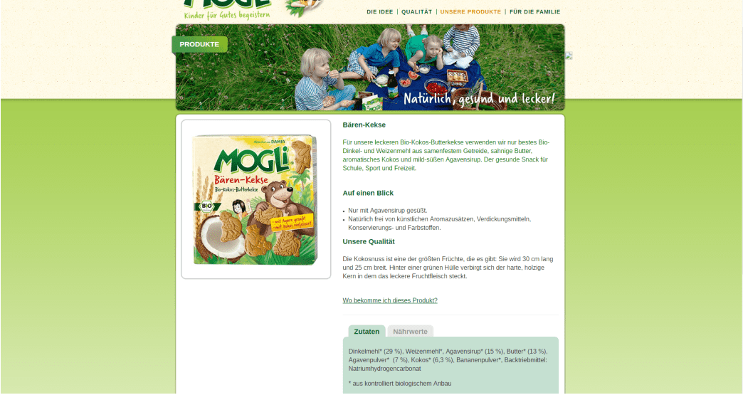
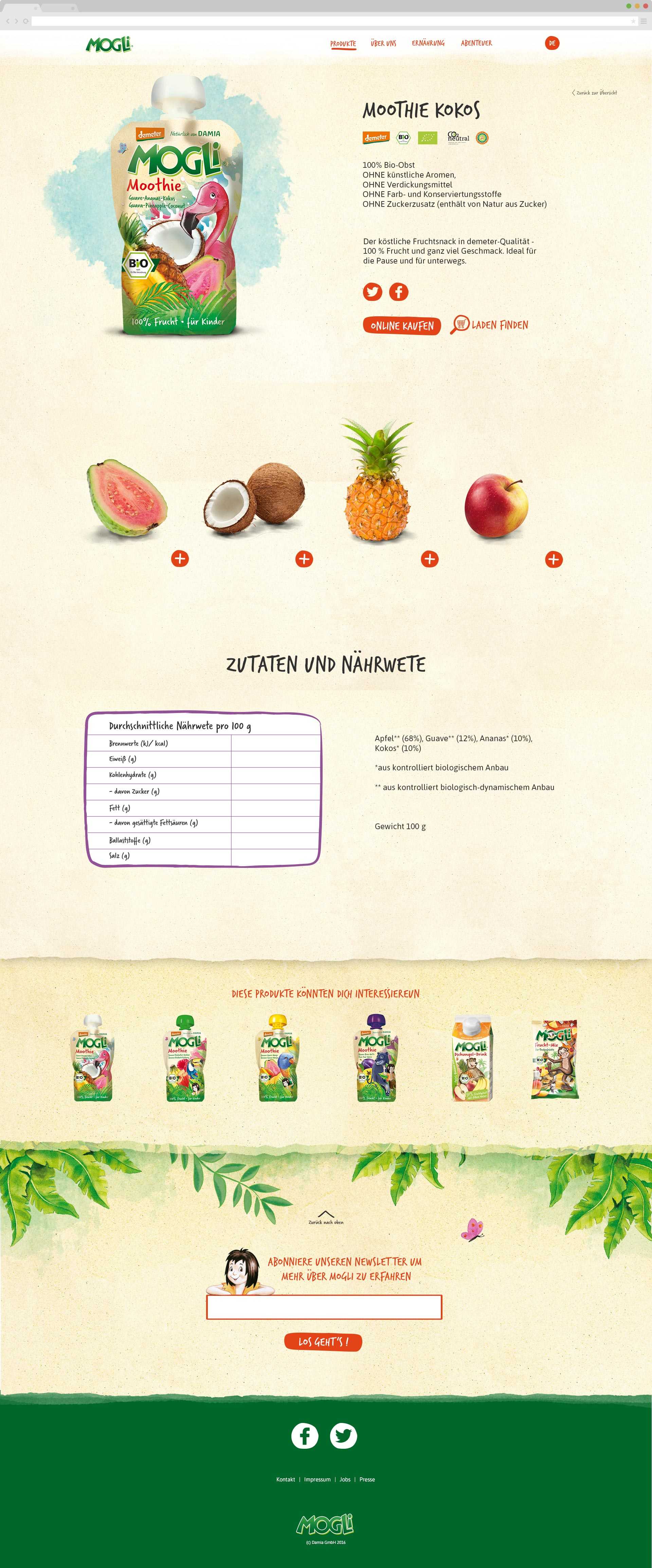
I paid special attention to the product detail pages as it was an important aspect for both the customer and the company to have all important information about ingredients and nutritional facts easily accessible. To emphasise the fresh and healthy character of the ingredients, the four main ingredients of each product would be shown with an extra image and with additional information.
On the “Adventure Page”, the adventurous jungle world would dominate the design. The subtle animation of Mogli climbing down the liane while the user is scrolling down would emphasise the page’s playfulness.
For the MOGLi Team it was kind of exciting to have a well performing responsive website for the very first time! For the MOGLi Team it was kind of exciting to have a well performing responsive website for the very first time!
Testing
Due to lacking resources and the whole project structure, testings weren’t conducted until the implementation of the designs. This was all but ideal as testings should be done as often as possible throughout the whole process starting as early as possible.
Taking into account the initially identified user goals and business goals I defined seven specific tasks testers would have to complete. I did the testing with five persons (three parents, two grandparents aged between 30 and 75) in three different browsers (Firefox, Chrome, Opera).
Negative Results
One main problem was the wording in the navigation that led to confusion among all participants. Texts on the website were perceived as too long and overwhelming. Apart from this, some technical details (e.g. user should come back on the same position on a page when using the browser's back function) and of course some small bugs could be discovered.
Positive Results
All users immediately realised the natural and ecological character of the products. The search function on the “Product Overview Page” and the “Adventure Page” was used and understood by all participants. All participants perceived the page’s overall impression as very appealing and high quality.
In addition to my own testing, I took the opportunity to use the “Peek Testing” by usertesting.com. It was very exciting to see a user from the US using the website (also a very good performance test). Here you can watch the video.
Lessons learned
It is very important to accompany the client while assessing project states - especially when clients aren’t very experienced with digital technologies. In 2016 remote design presentation tools weren’t as numerous as today - I just had known InVision at this time. Presenting and explaining all steps of the process is important to avoid misunderstandings and unnecessary work.