Fraunhofer IAO: Business Model Co-Creator
Within the scope of the Project INDiGeR, the Fraunhofer Institute for Industrial Engineering IAO advises stakeholders of complex service networks on the development of innovative business models. To support the consultants’ work we were asked to develop a web-based tool to better coordinate and integrate the interests, resources and tasks of the network members.
Client
Fraunhofer GesellschaftMy Role
UX Design & Project ManagementLaunch
2017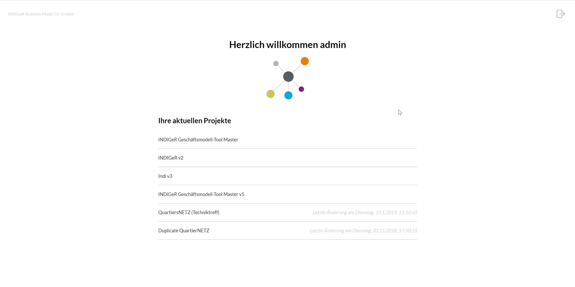
My role
We were realising this project in a team of two - a software engineer and me. So in addition to my job as a UX Designer I was responsible for the project management.
Pitch
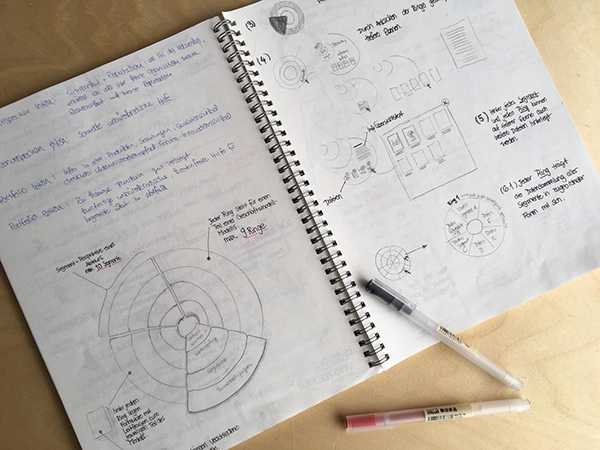
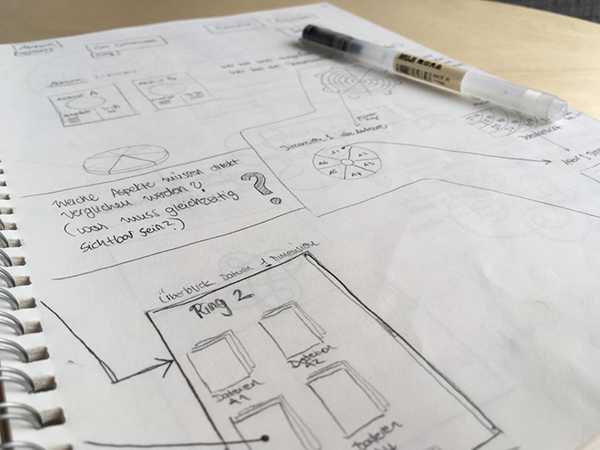
Based on a project brief containing detailed requirements and indications on the tool’s visual impression, I developed a rough architecture and some first designs. The clients’ core idea was a circular diagram kind of look with rings representing different business model dimensions and segments representing stakeholders.


With our first ideas on architecture and visual design, we were able to convince the client and win the pitch.
Understand
What exactly are service networks? What kind of business models are there and what are they for? How do consultants use business models and how does the consulting process look like? These are just a few questions I tackled in the first phase of the project.
An in-depth research and numerous discussions with the clients helped me to grasp the overall subject. In addition to the project brief, we were provided with a detailed description of all phases of the context of use: from the network members joining together and assigning Fraunhofer with the consulting to the phase of workshop preparation to the actual workshop situation and finally to workshop evaluation. As it was not possible to actually accompany consultants during their process, this detailed description was a great substitute.
Concept
The main challenge was displaying big amounts of text data in a clearly arranged manner. These data were collected from all stakeholders of a service network through a LimeSurvey. Consultants would have to be able to analyse, compare and rearrange these data with the tool, quickly gain an overview but also dig deeper wherever necessary.
Additionally, the tool would have to be scalable and would have to implement different kinds of business models (Business Model Canvas, St. Galler Dreieck (Magic Triangle), INDiGeR Model), so the content would have to be dynamically adjustable.
Besides collecting and organising data, consultants would have to be able to present and reorganise data in live workshop situations in collaboration with all workshop participants.
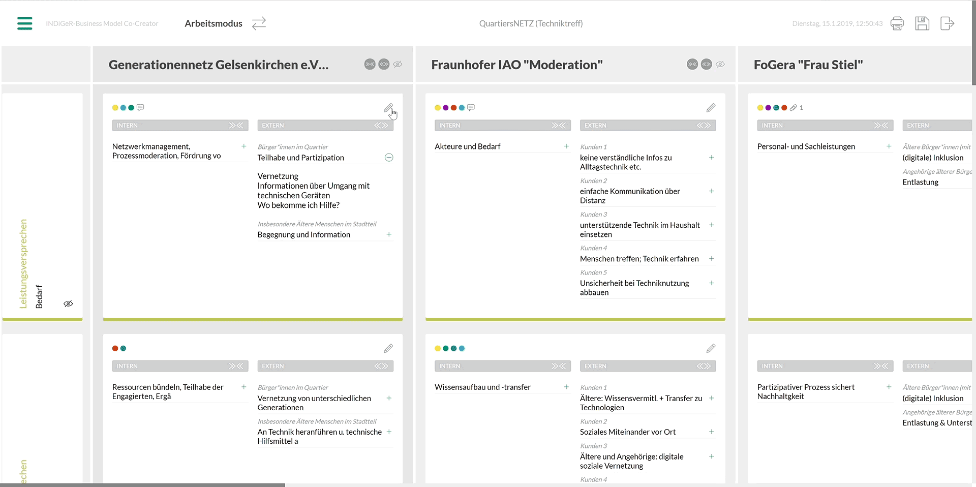
So I developed an architecture that would offer two modes: “Working Mode” for the consultants to collect, organise and prepare the data and “Presentation Mode” for the workshop situation.
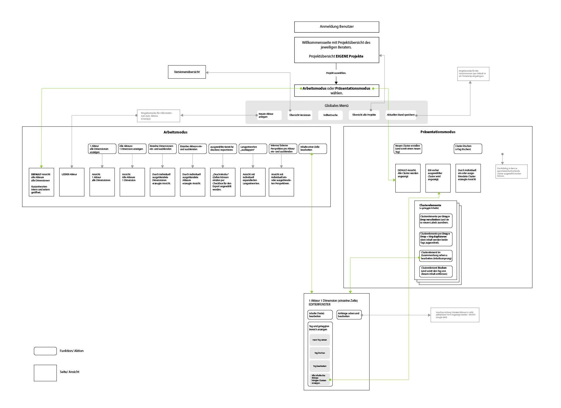

The “Working Mode” would offer a broad overview of all data of all network members.
In the course of my research, I had realised that the initial approach with the circular representation of network members and business model dimensions would not be adequate to meet the tool’s purposes and the users’ needs. So I decided to work with dynamic tables instead - columns representing network members and rows representing dimensions. Consultants would be able to create individual views by collapsing or hiding certain content or invoke more detailed information where necessary.
The “Presentation Mode” on the other hand would show the already organised content following some kind of Metaplan look. The tags created by the consultant would now be displayed as cards containing all content that had been tagged. The particular source of each tagged text snippet would be retraceable to view its context where necessary. Cards and text snippets would be moveable via drag and drop, changing the tags accordingly.
Before working on a refined visual design I built a clickable prototype in Adobe XD and shared it with the client.
Visual Design
Colours and fonts were determined by the client so I had to work my visual design around these styles. Displaying the huge amount of textual data without overcharging the user was the main challenge of the visual design.
Sufficient white space and a clear visual structure built the core of my approach. A set of meaningful icons should help users to navigate easily between the two modes (“Working Mode” and “Presentation Mode”) as well as between the different levels of complexity.

For the tagging and the comment function, I implemented clear and easy to understand context menus that would give users all the freedom they require to create tags and organise the data according to their needs.
Thanks to the individual colour coding of tagged content, the correspondent information is recognised easily throughout the tool. Different visualisations of the tagged content (clusters on the start screen, Metaplan view in presentation mode) make it easy to gain an overview of core topics quickly.
Jumping back and forth between clustered/ tagged snippets of information and its source/ wider context ensures excellent orientation.
Of course, the tool would have to work on mobile devices too.

Testing
The testing was conducted internally and only after the tool was fully implemented. Testing this late in a project of course never is ideal but unfortunately happens often as clients do not have sufficient resources. Fortunately in this project testing late didn’t result in a catastrophe as we were in close and regular exchange with the clients who in turn were in close exchange with the consultants.
When test results were presented to us and the rest of the team, we learned that another tool with the same requirements had been developed by another team. So we actually were confronted with A/B testing results.
Besides some small change requests (e.g. making typo a little bit darker), the whole team of consultants was very enthusiastic about the tool and agreed that it facilitated their work a lot. One consultant even commented: “I’m in consulting for over 20 years now and I have seen many digital tools - oftentimes developed by huge teams - but I have never seen such a helpful and easy-to-use tool as yours.”
The tool developed by the other team had incorporated the circular diagram kind of look that I had dismissed in the course of my research. Interestingly this tool was perceived as very confusing (even though visually pleasing) and difficult to use.
Lessons Learned
Extensive research at the beginning of a project is always worth it, even though it takes quite some time. My research helped me to give the clients well-founded advise and finally led to a valuable product.